(un)natural
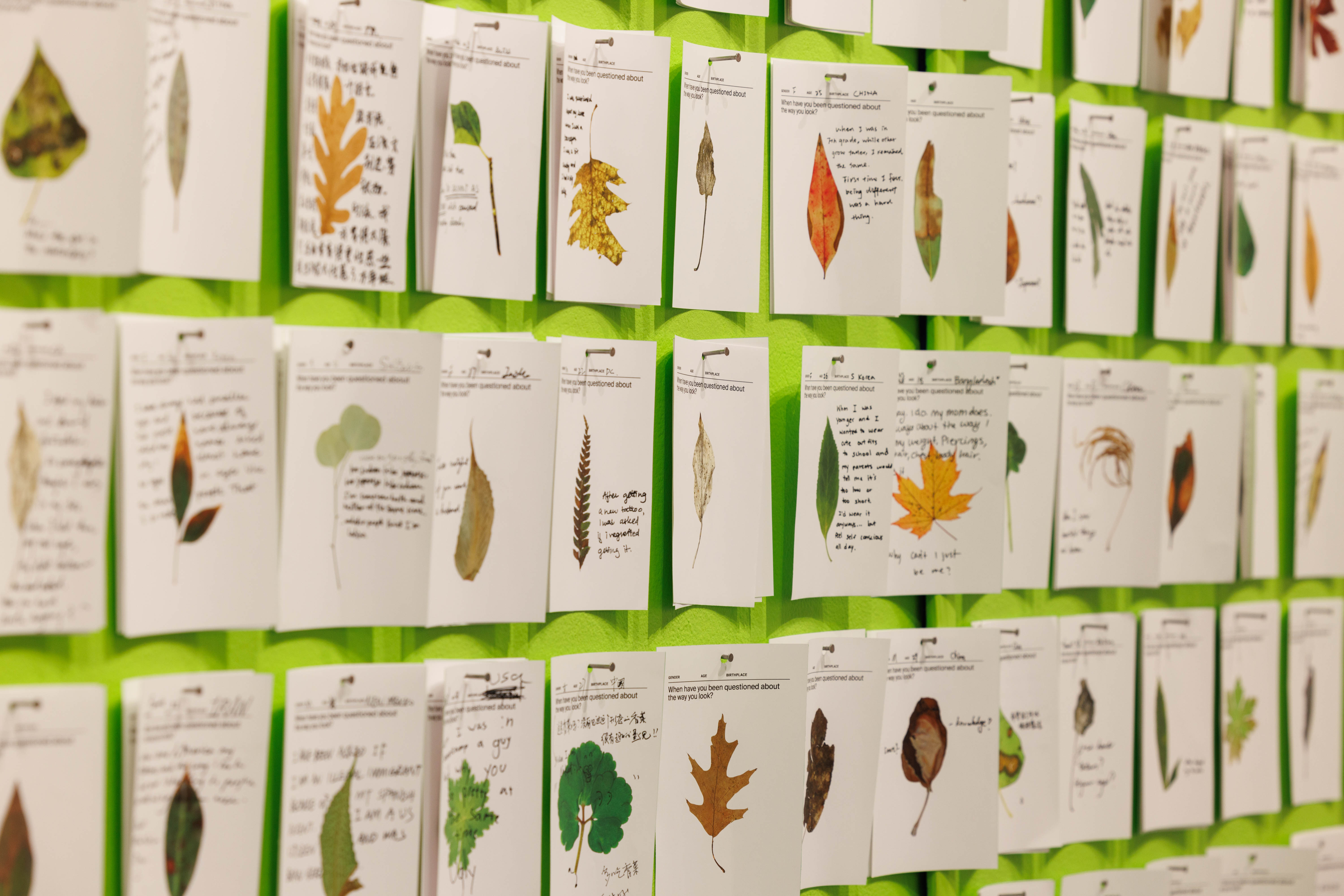
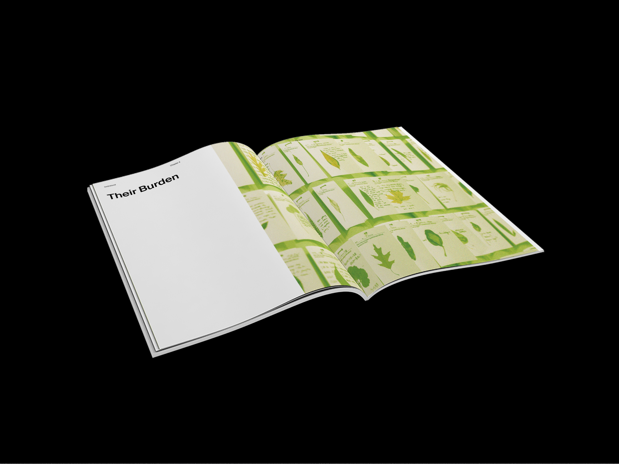
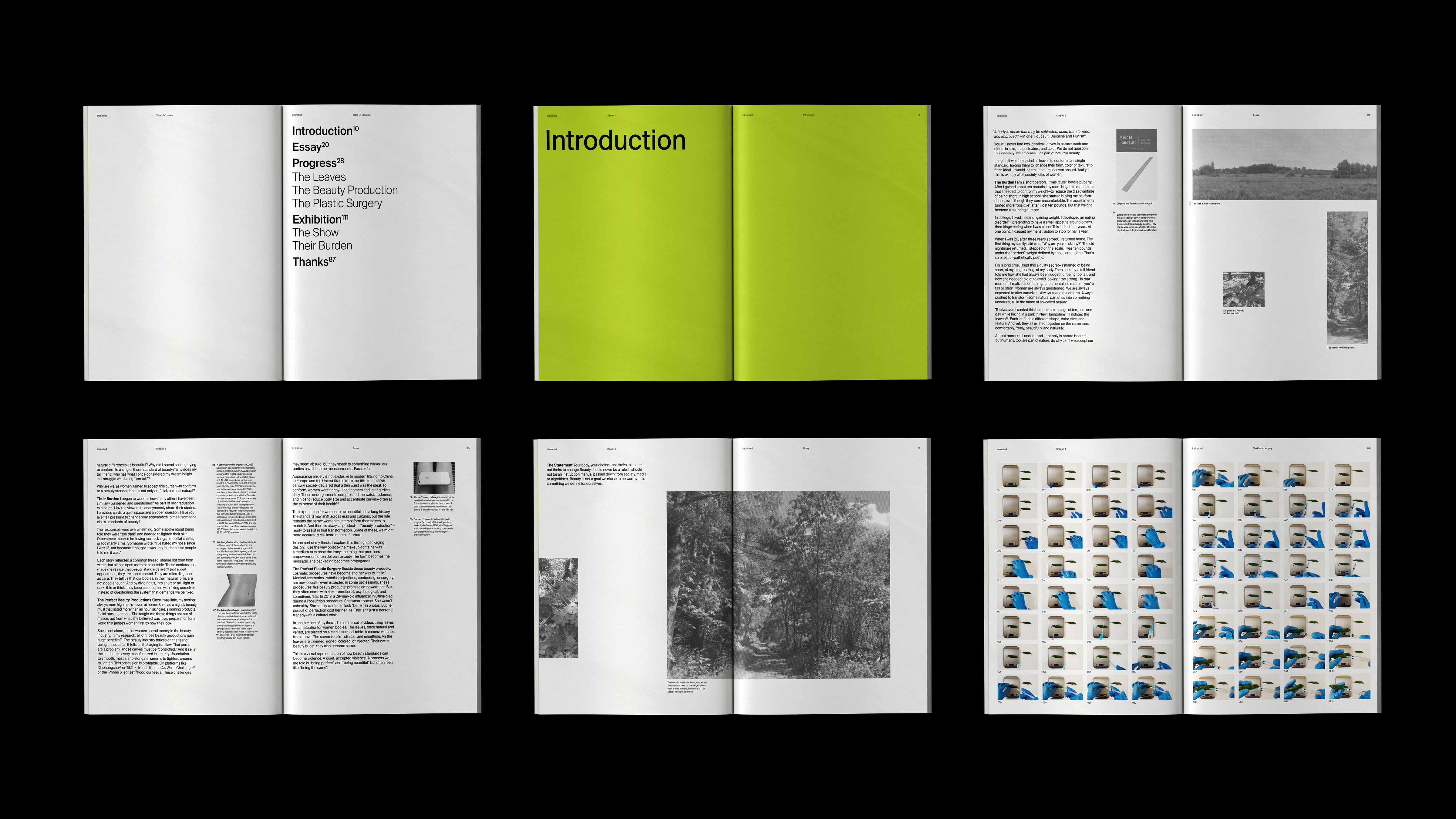
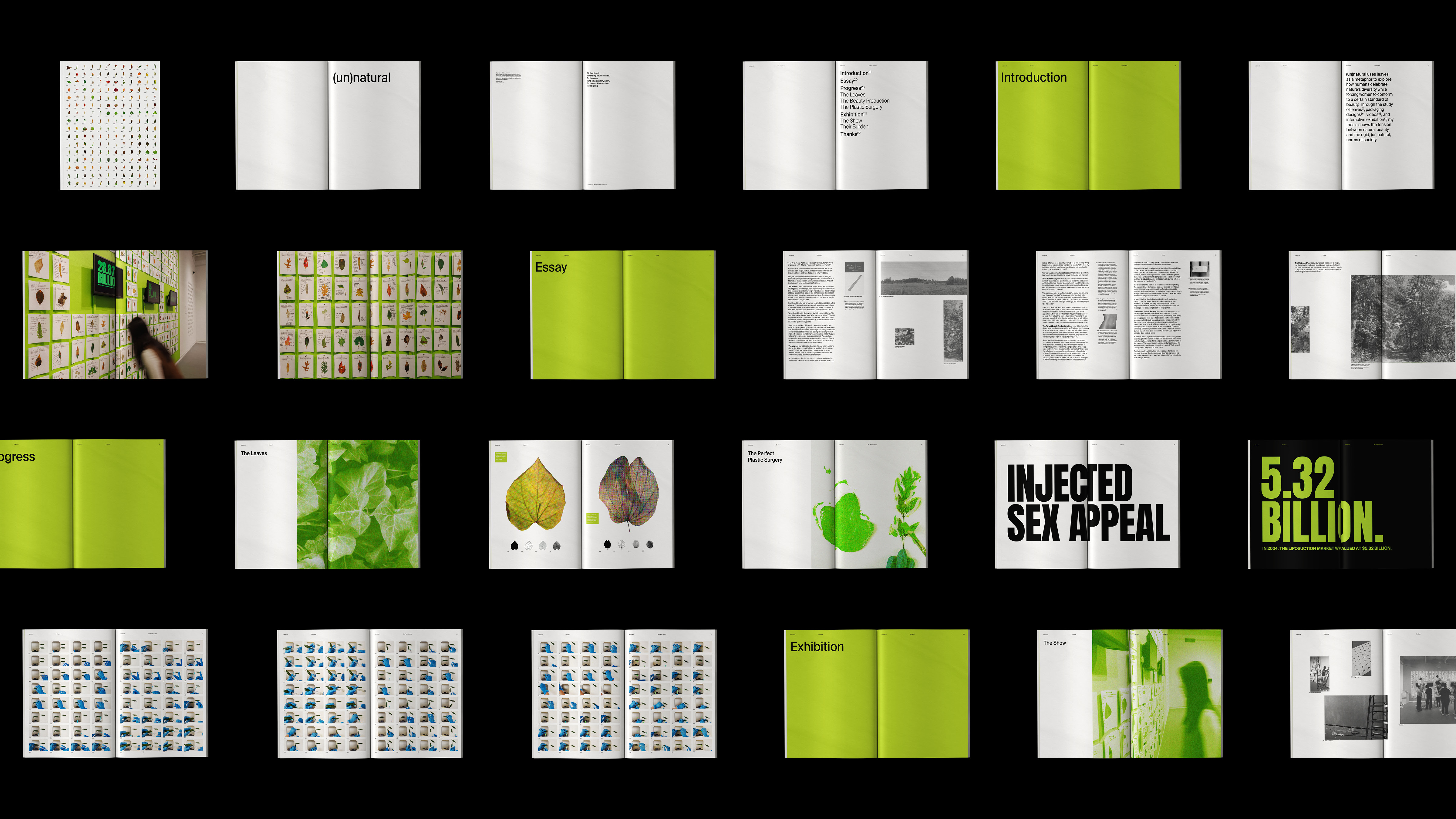
Interactive, Video, PostcardsLeaves come from nature, and we accept the beauty of their diversity. You will never find two identical leaves in nature—each one differs in size, shape, texture, and color. We, too, come from nature—yet we alter, refine, and falsify ourselves, shaping our natural beauty into something (un)natural. My videos show disturbing manipulations of natural leaves, while the postcards invite reflection on how we are expected to conform to beauty standards.




Dailies
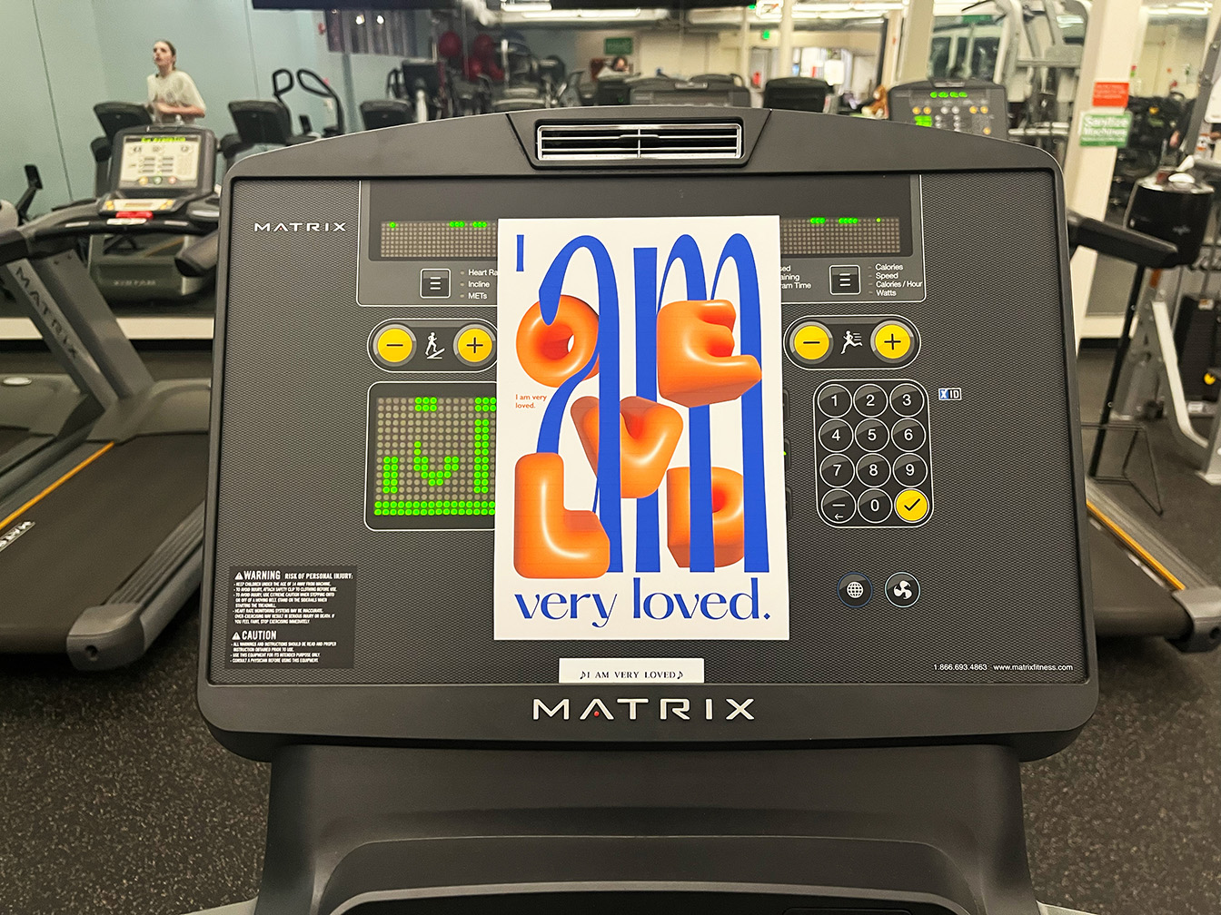
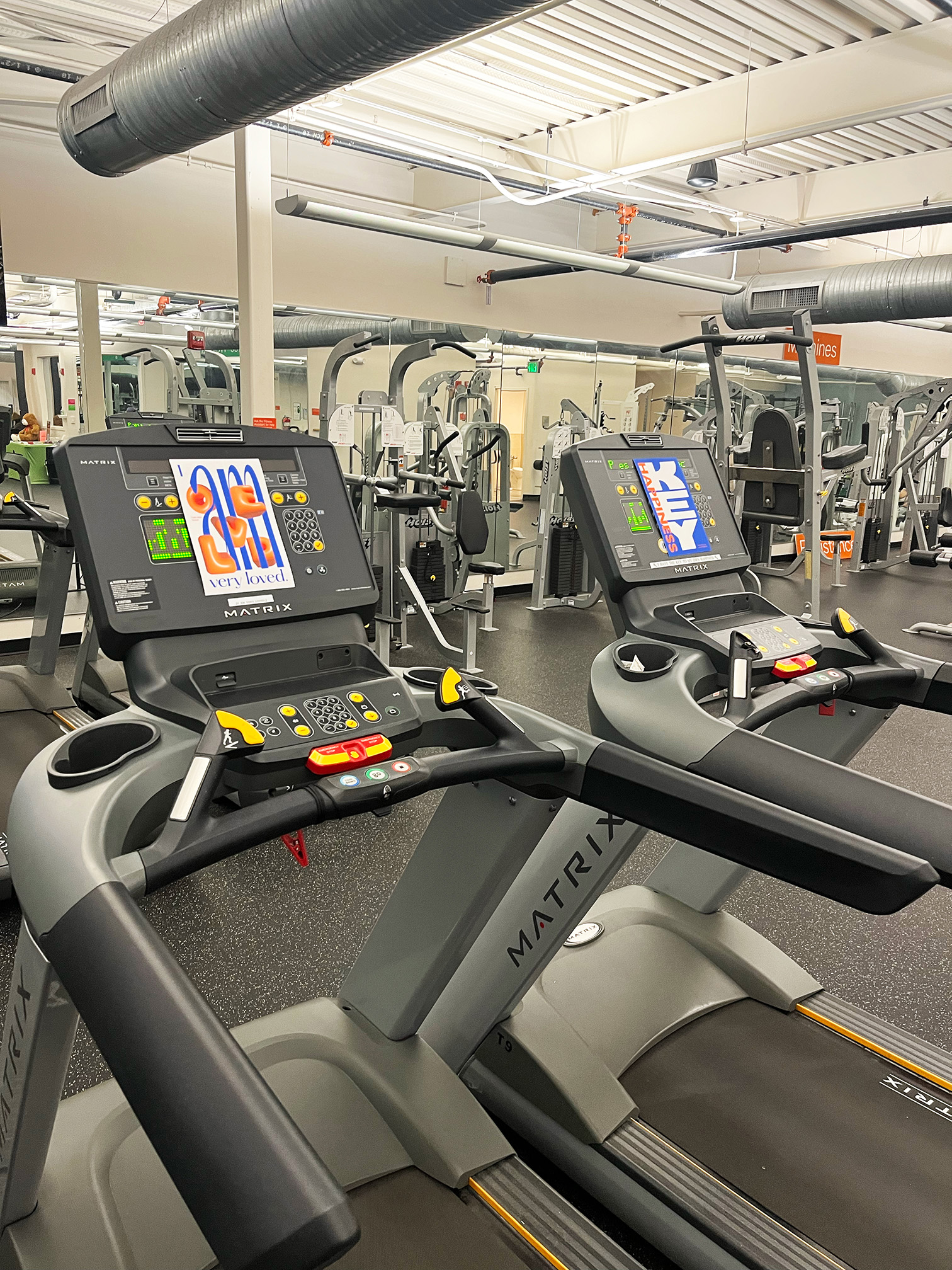
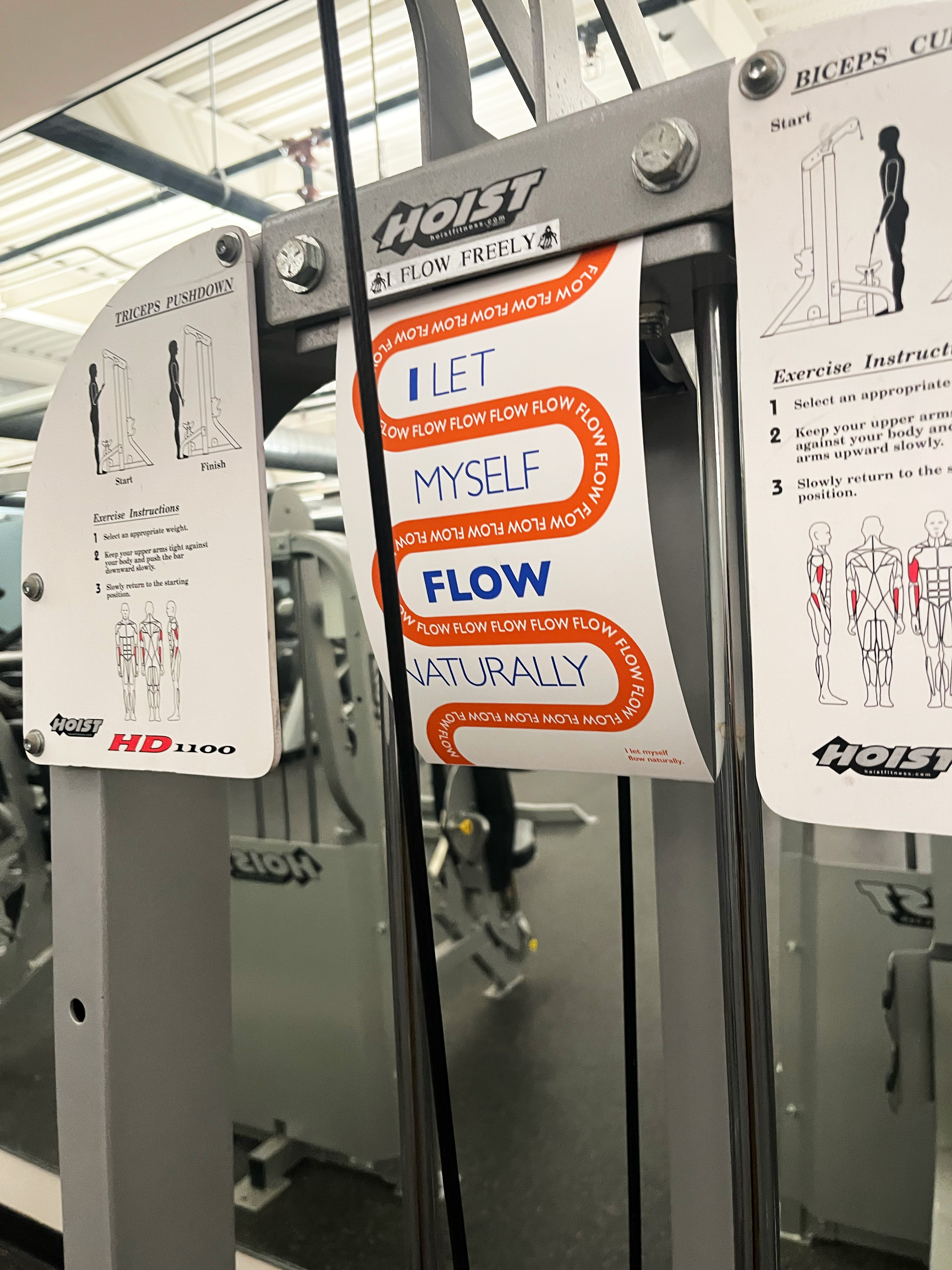
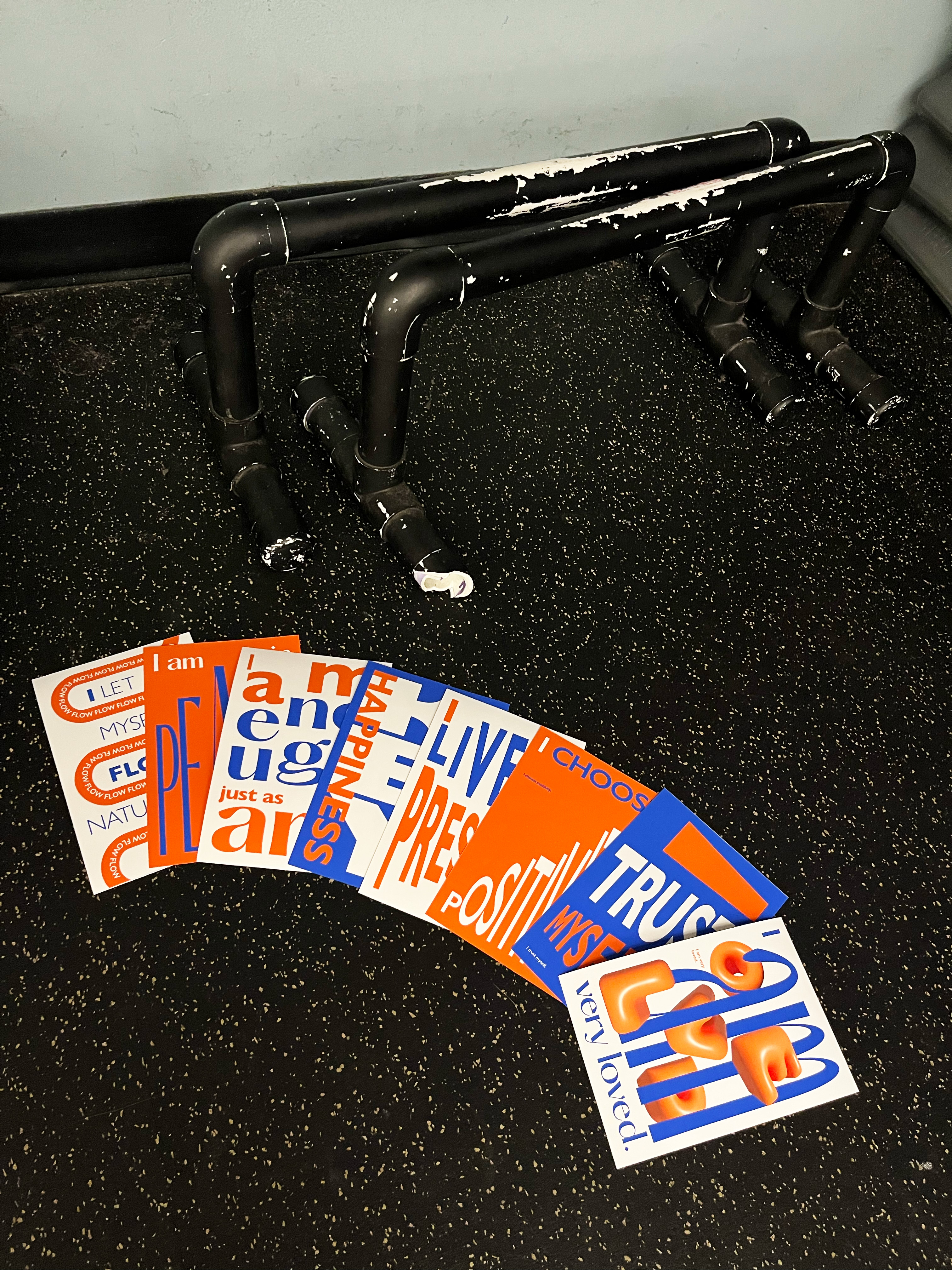
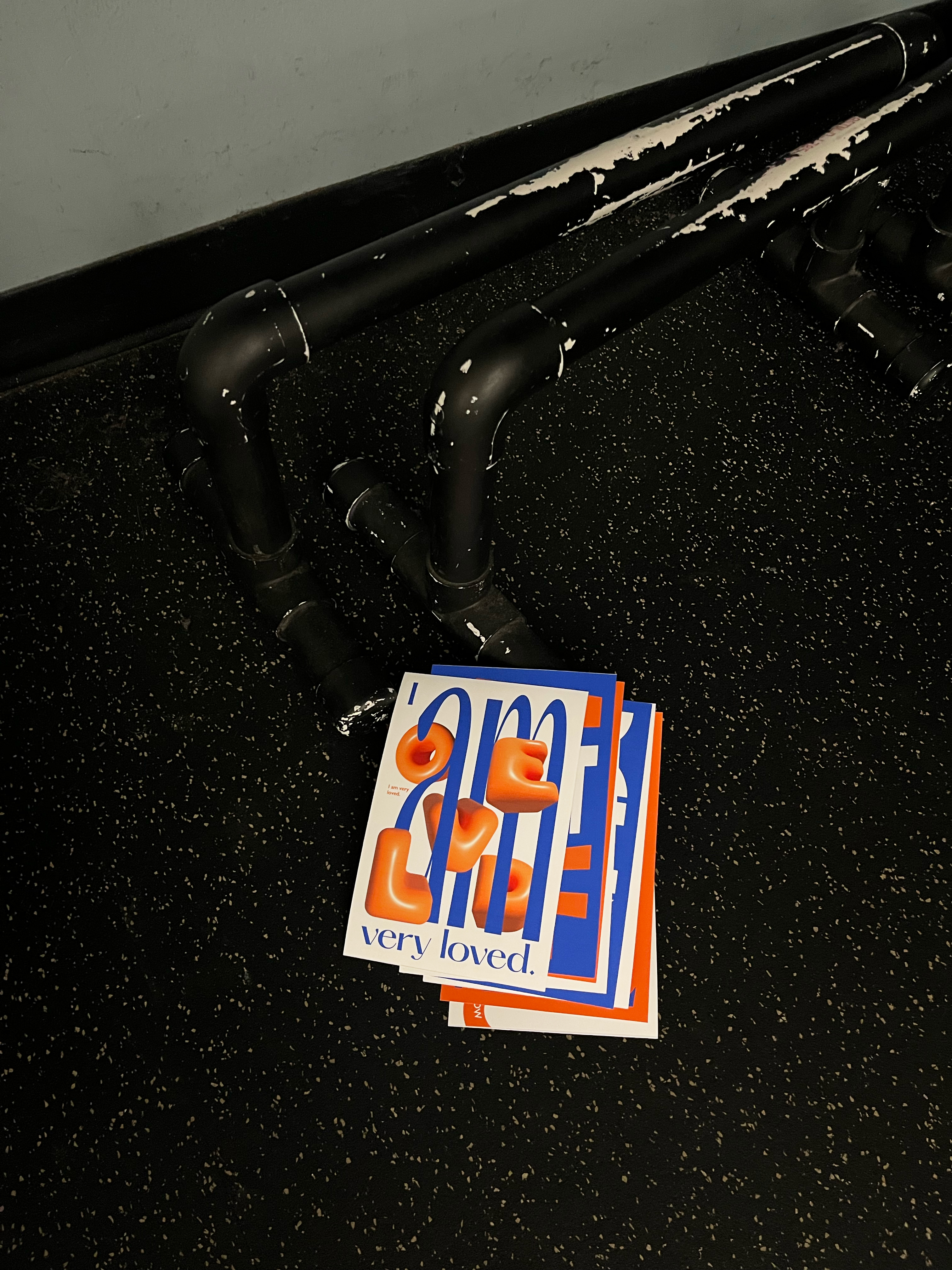
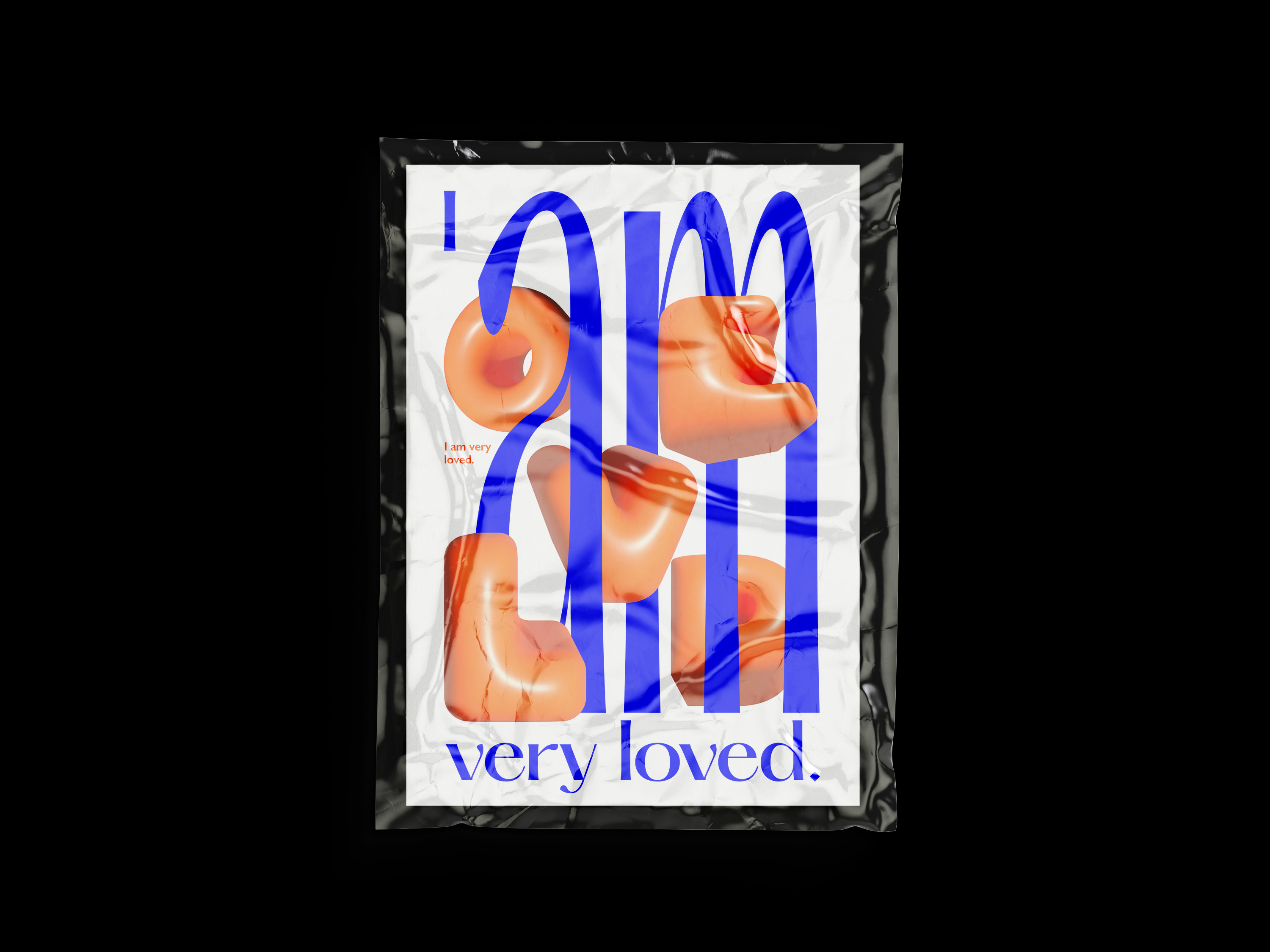
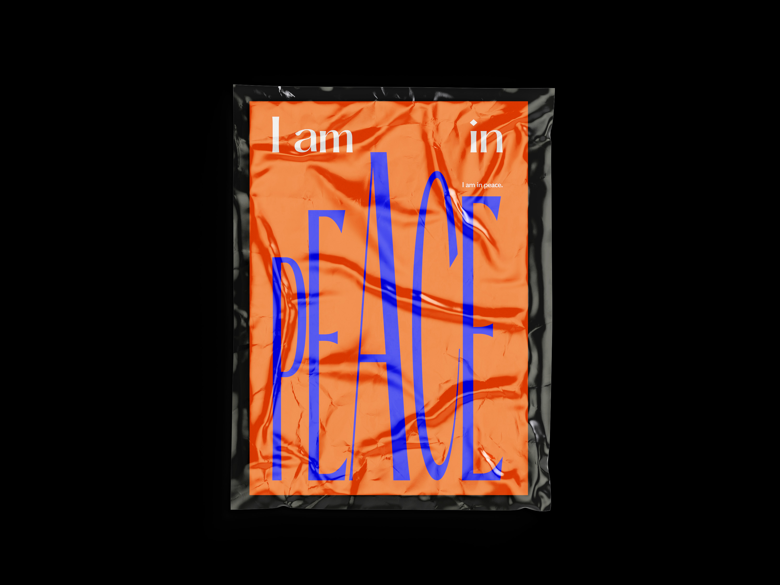
Typography, PostcardThis series of typographic postcards centers on form and composition. Leveraging the power of type alongside a harmonious blend of complementary colors—orange-yellow and purple-blue—the designs evoke an energetic and positive ambiance.


Refract
Branding, Social media,Client:
ABFS
ABFS
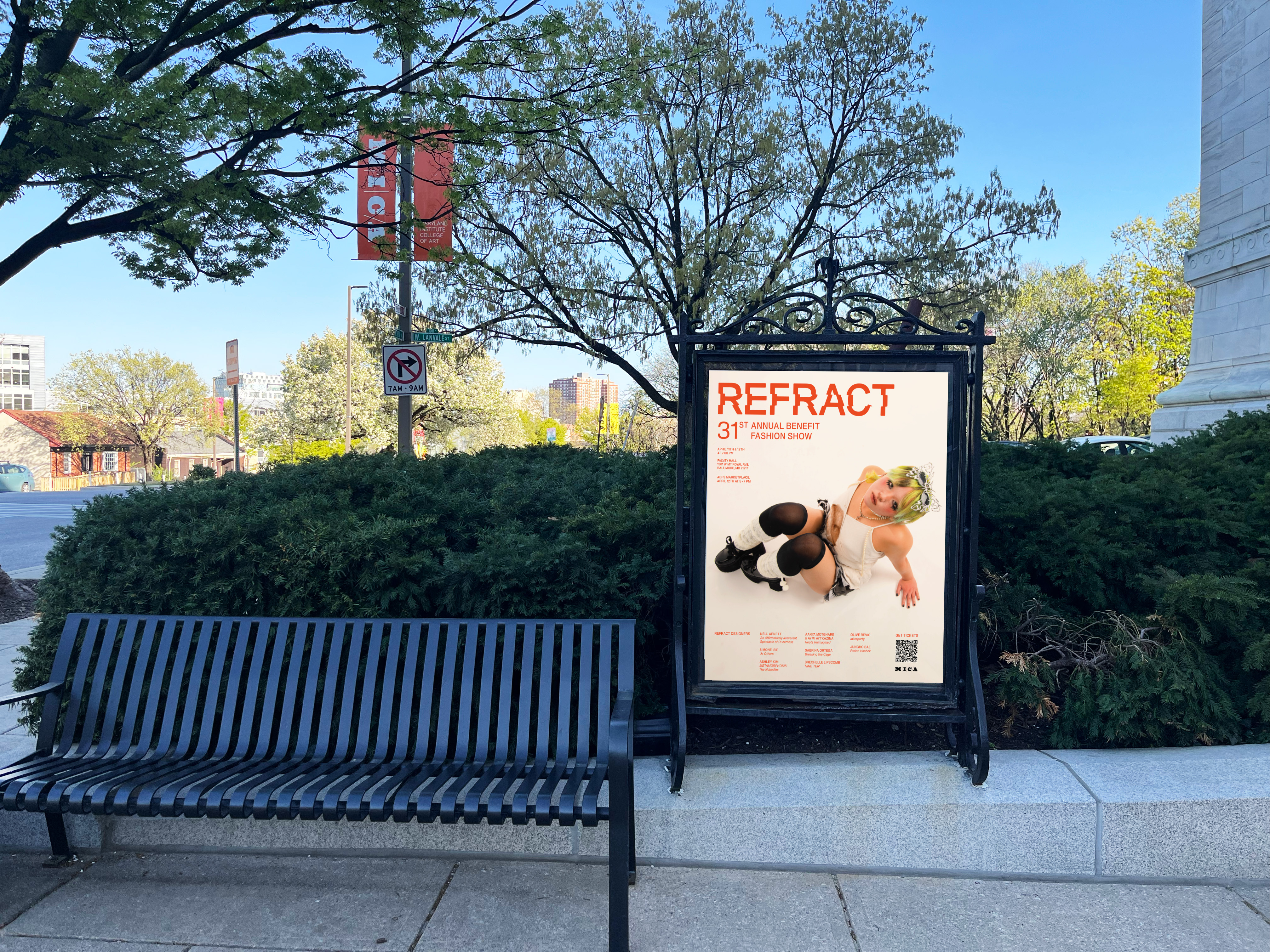
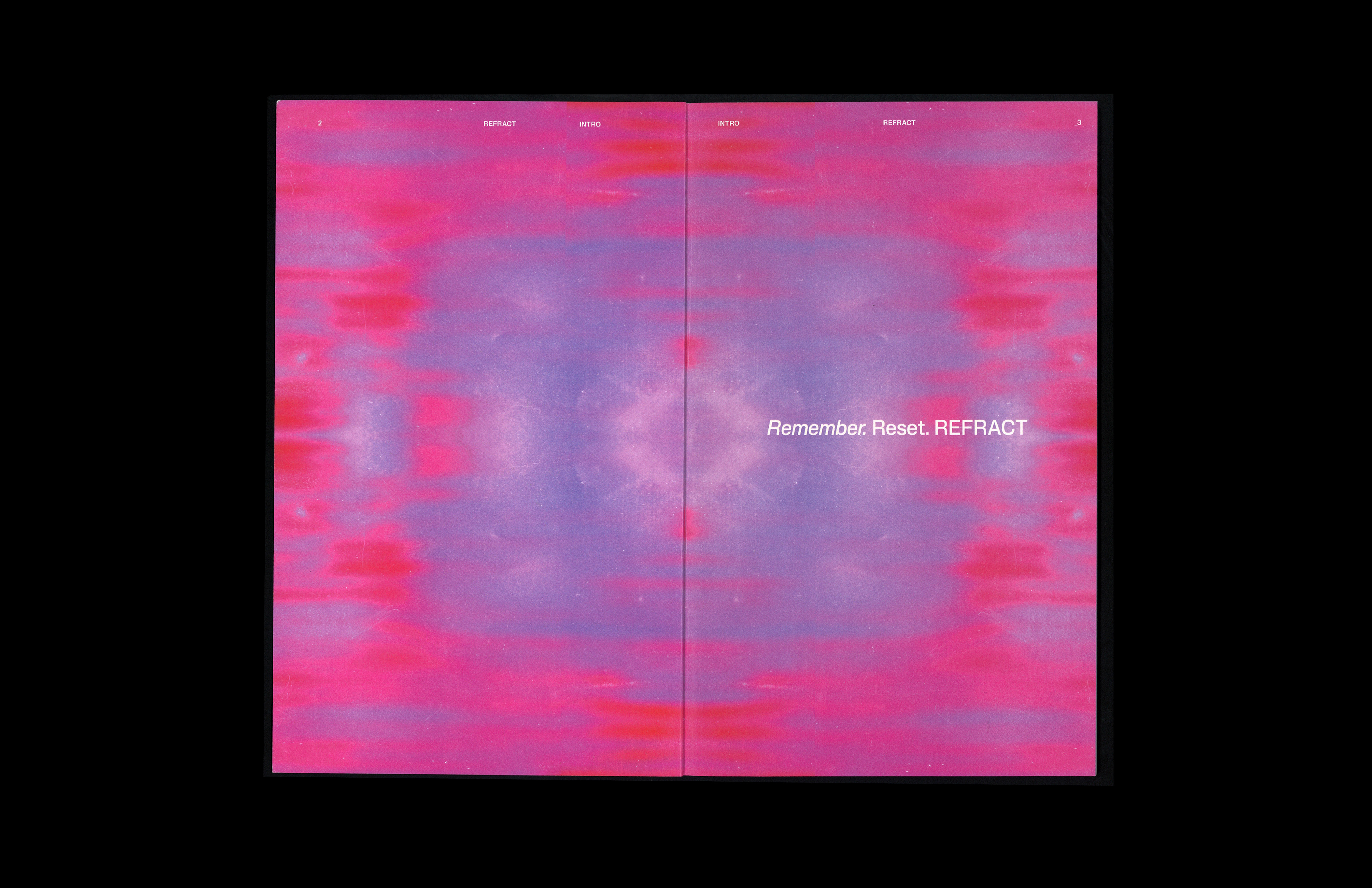
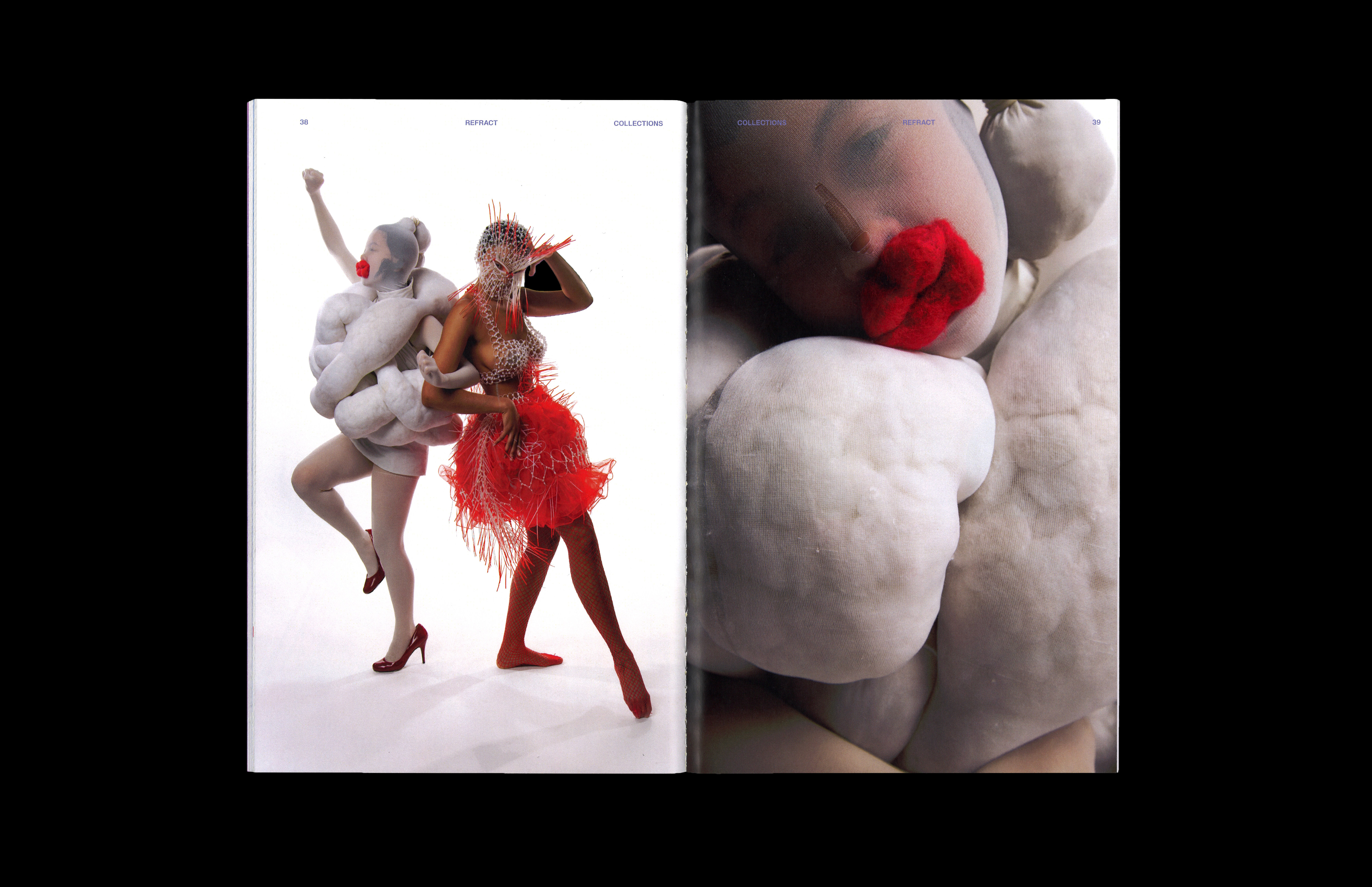
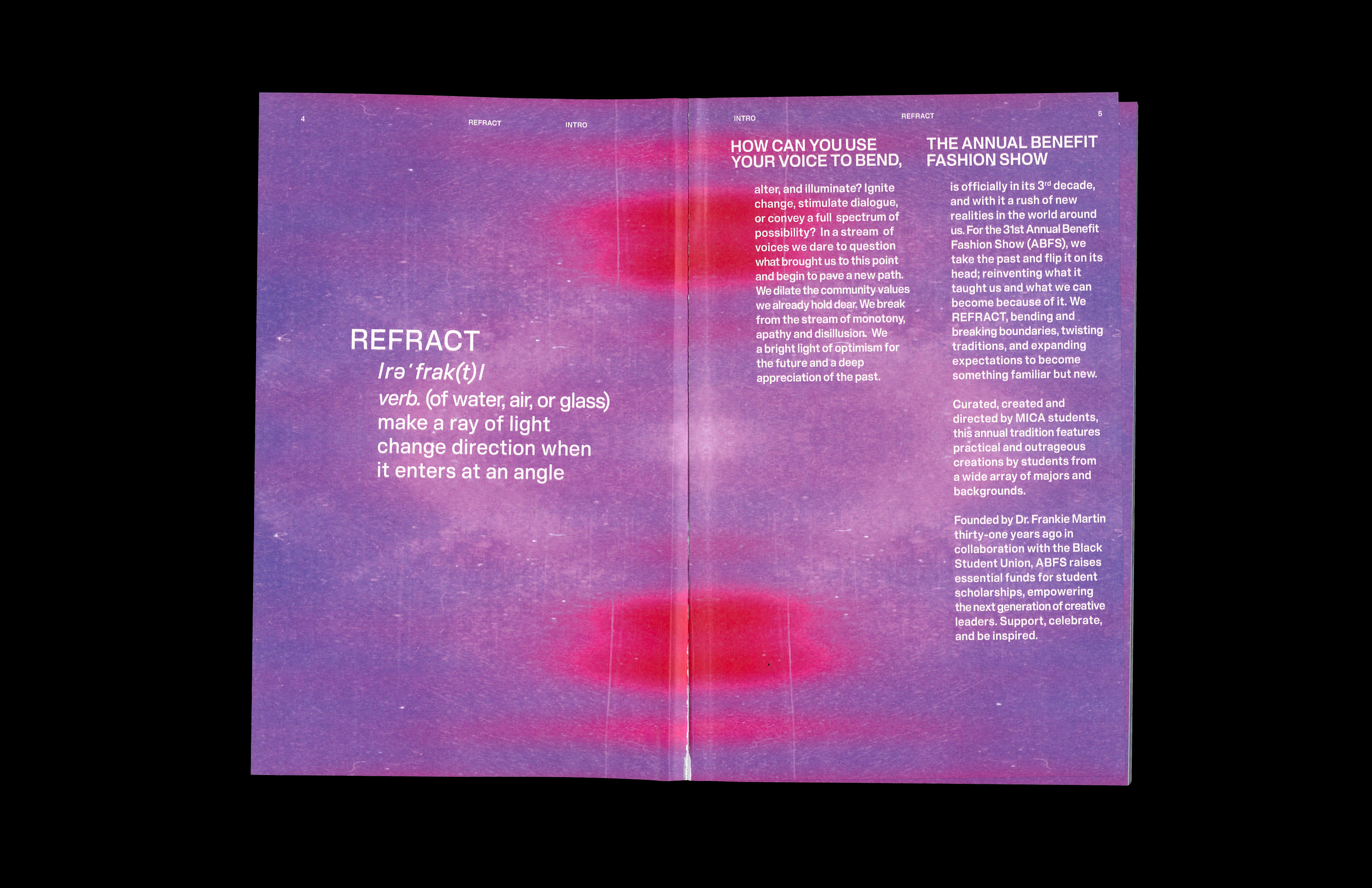
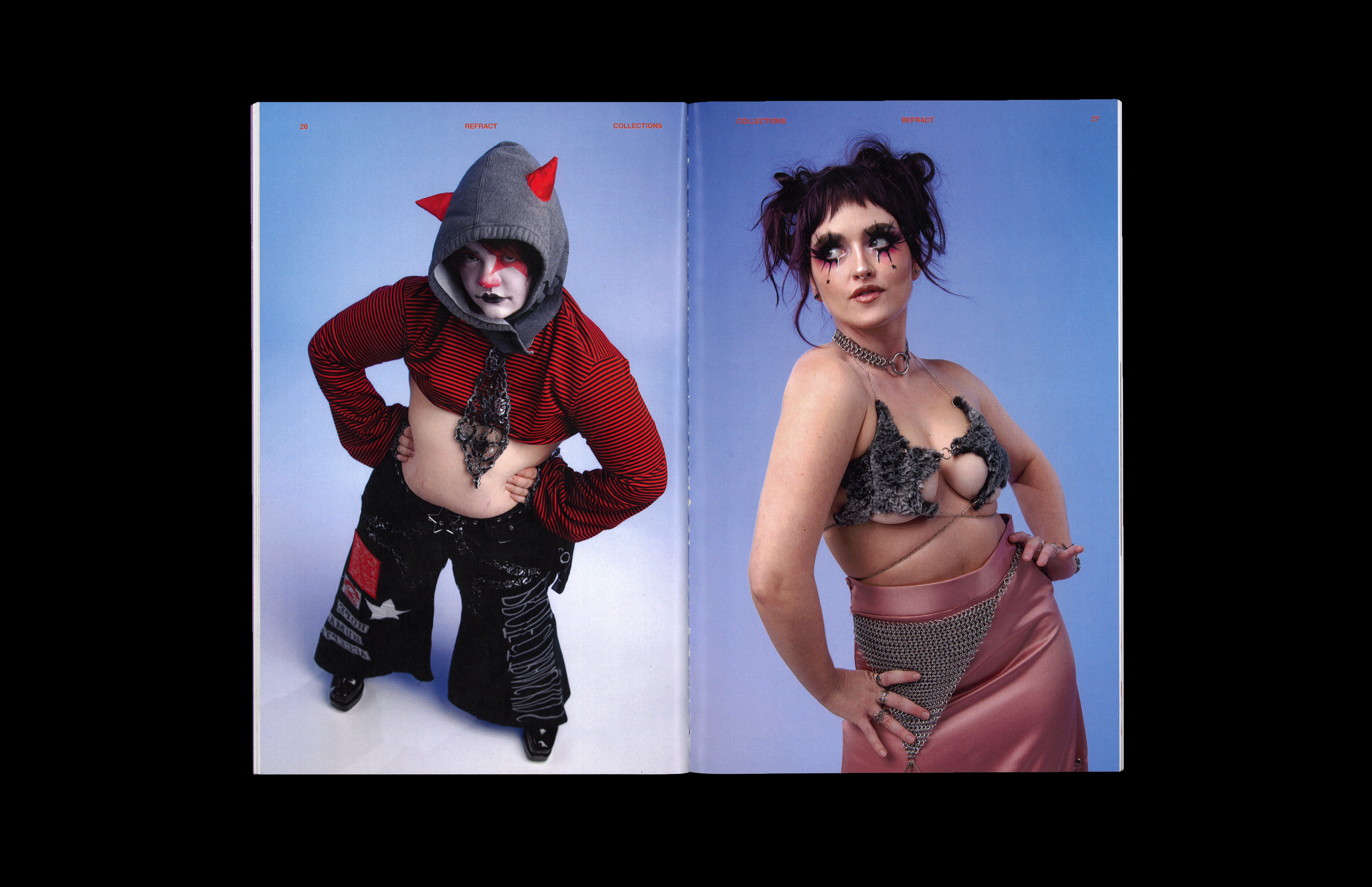
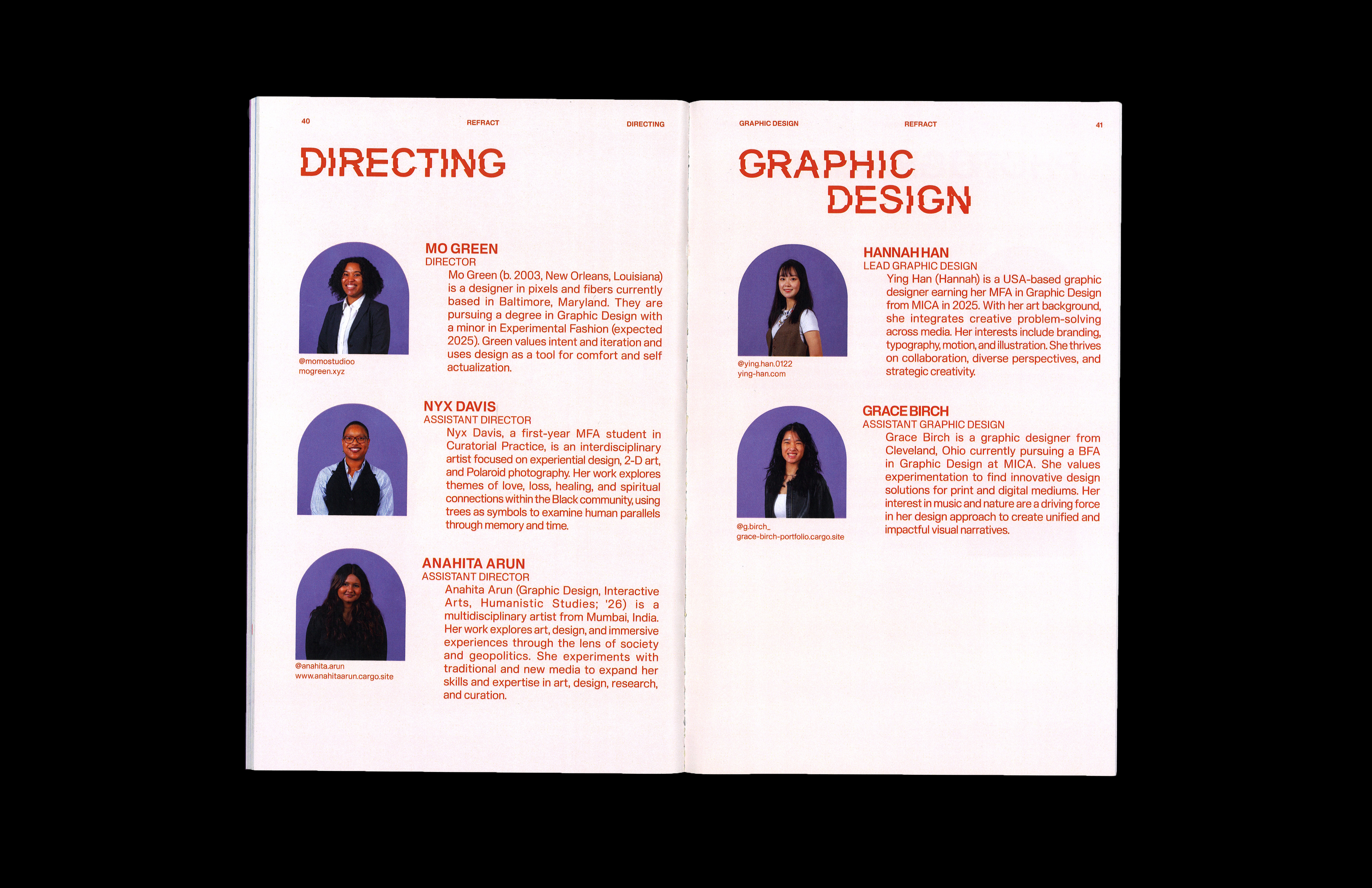
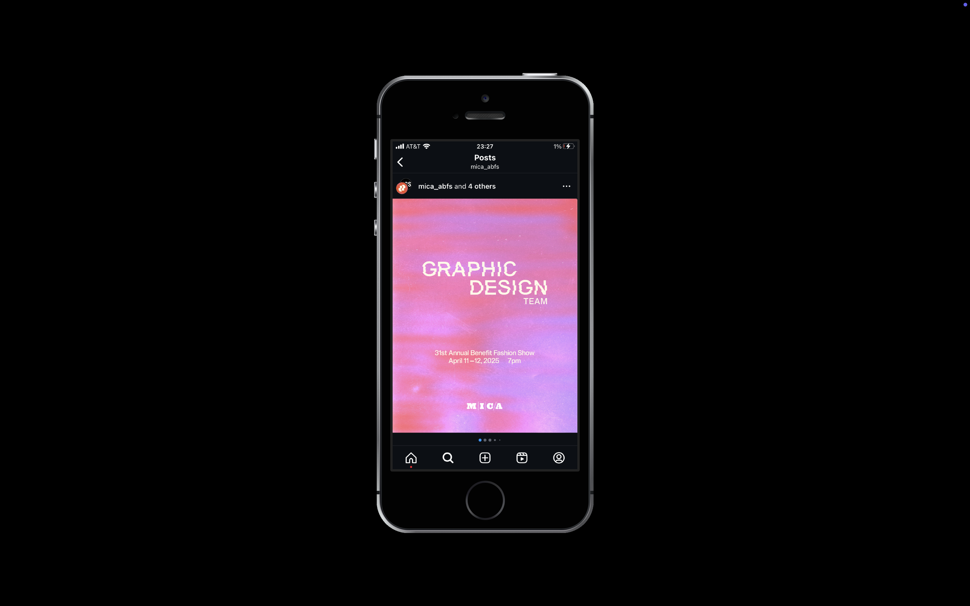
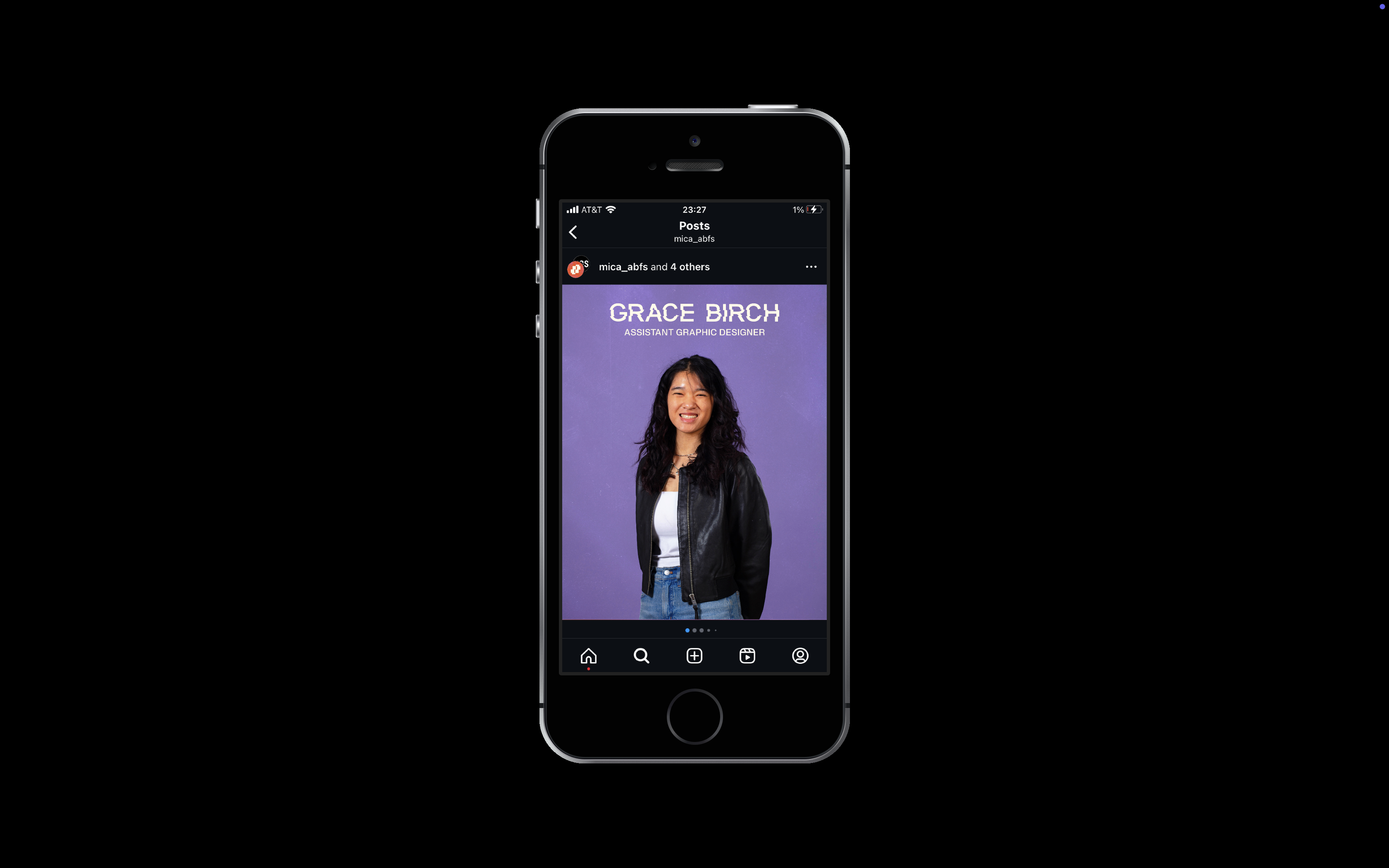
Led the design and art direction for the branding, marketing, and publication materials for Refract, the 31st Annual Benefit Fashion Show at MICA. Developed a custom display typeface and gradient-texture background inspired by the concept of refraction. Applied cohesive visual elements across all deliverables, including the lookbook, social media graphics, logo, icon, posters, flyers, and event typography.






BAM (Brooklyn Academy of Music)
PublicationBest of AIGA Baltimore Flux
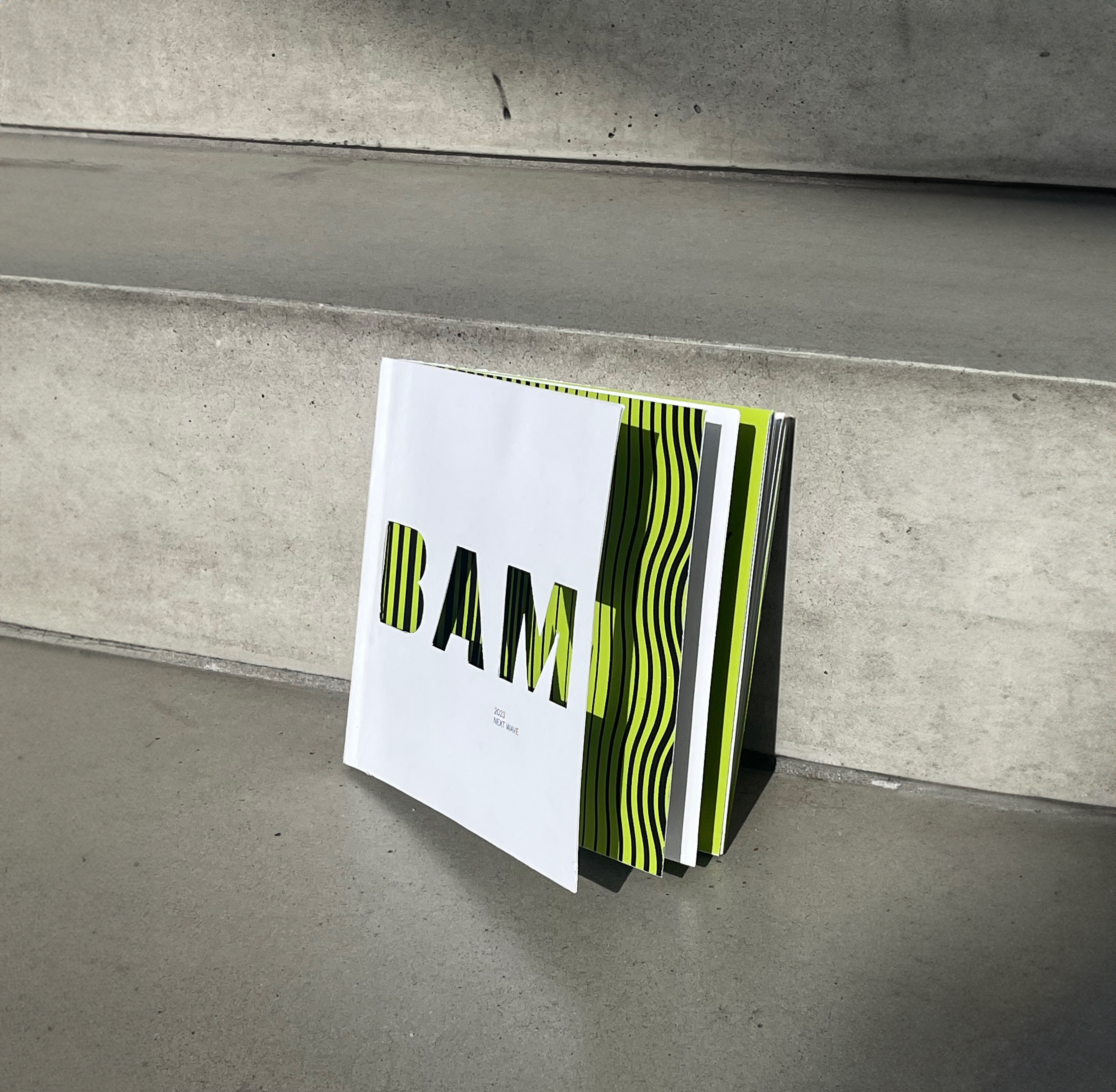
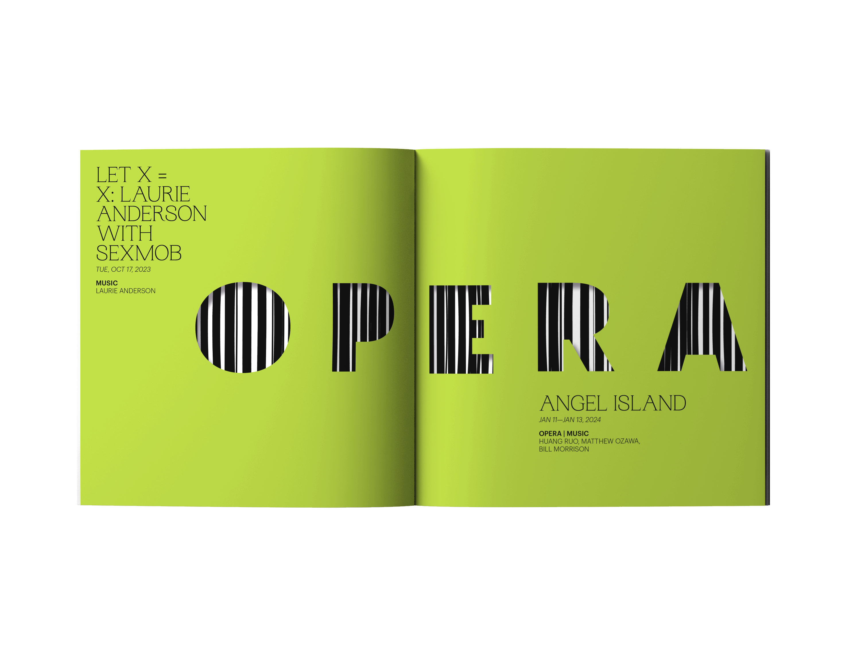
This concept design for the BAM (Brooklyn Academy of Music) event "New Wave" draws inspiration from the dynamic interplay of theater drapes and stage lighting. Employing die-cut typography and lighting patterns, the design reflects the diverse chapters and themes of the event. Each chapter is characterized by a unique pattern, mixing with images to convey a cohesive visual narrative.






Every Pecfect Day
Package Design, PhotographyWinner of Indigo Design Award
Winner of AIGA Baltimore Flux
Winner of Creative Quarterly 78
Shortlist of Communication Arts
Winner of Creative Quarterly 78
Shortlist of Communication Arts
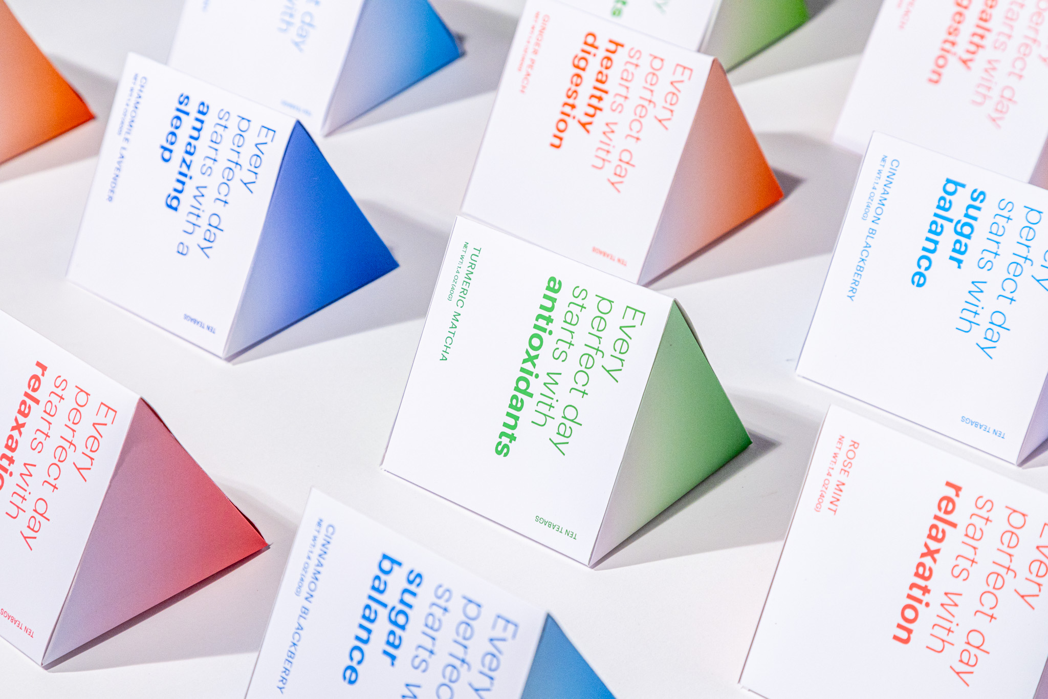
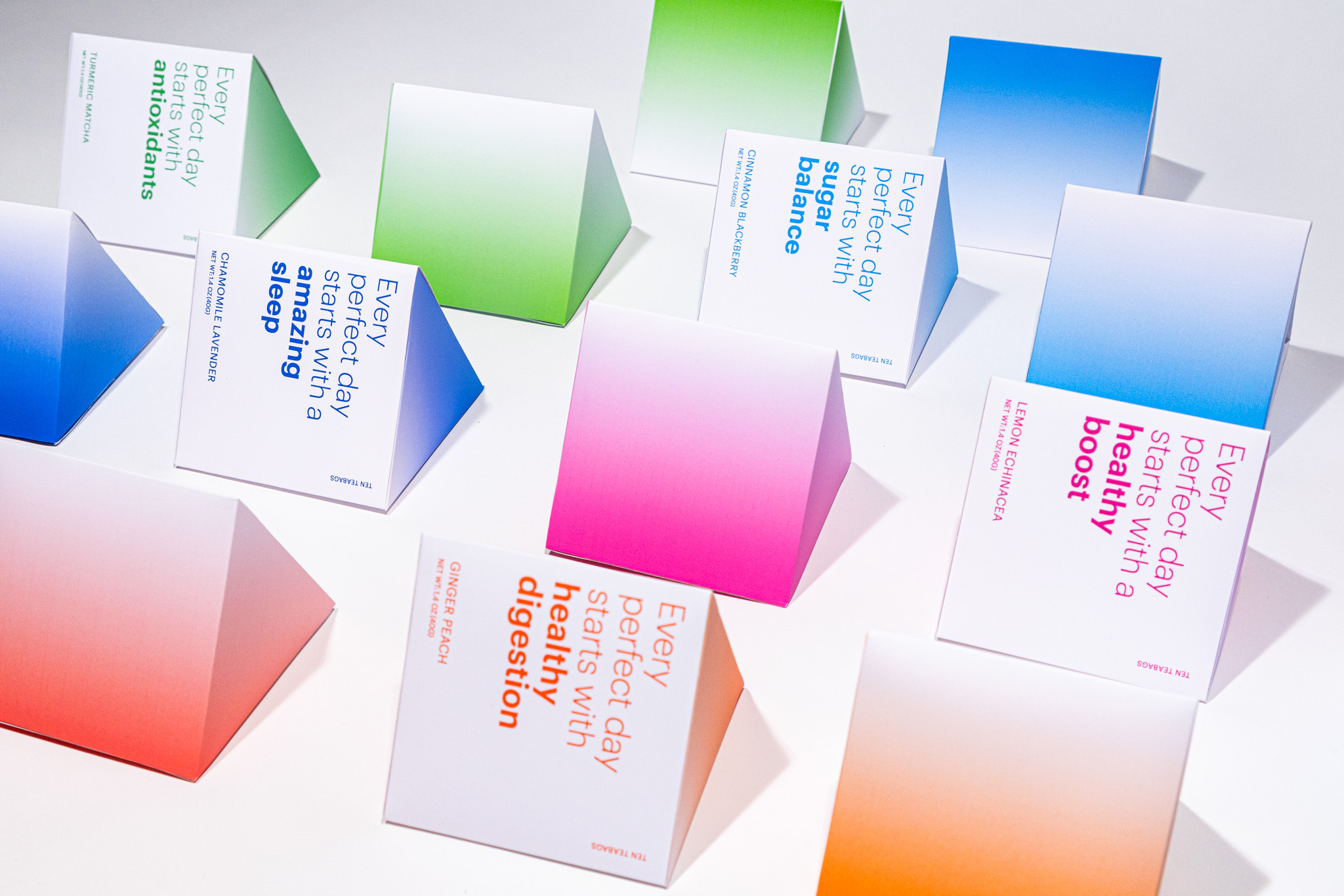
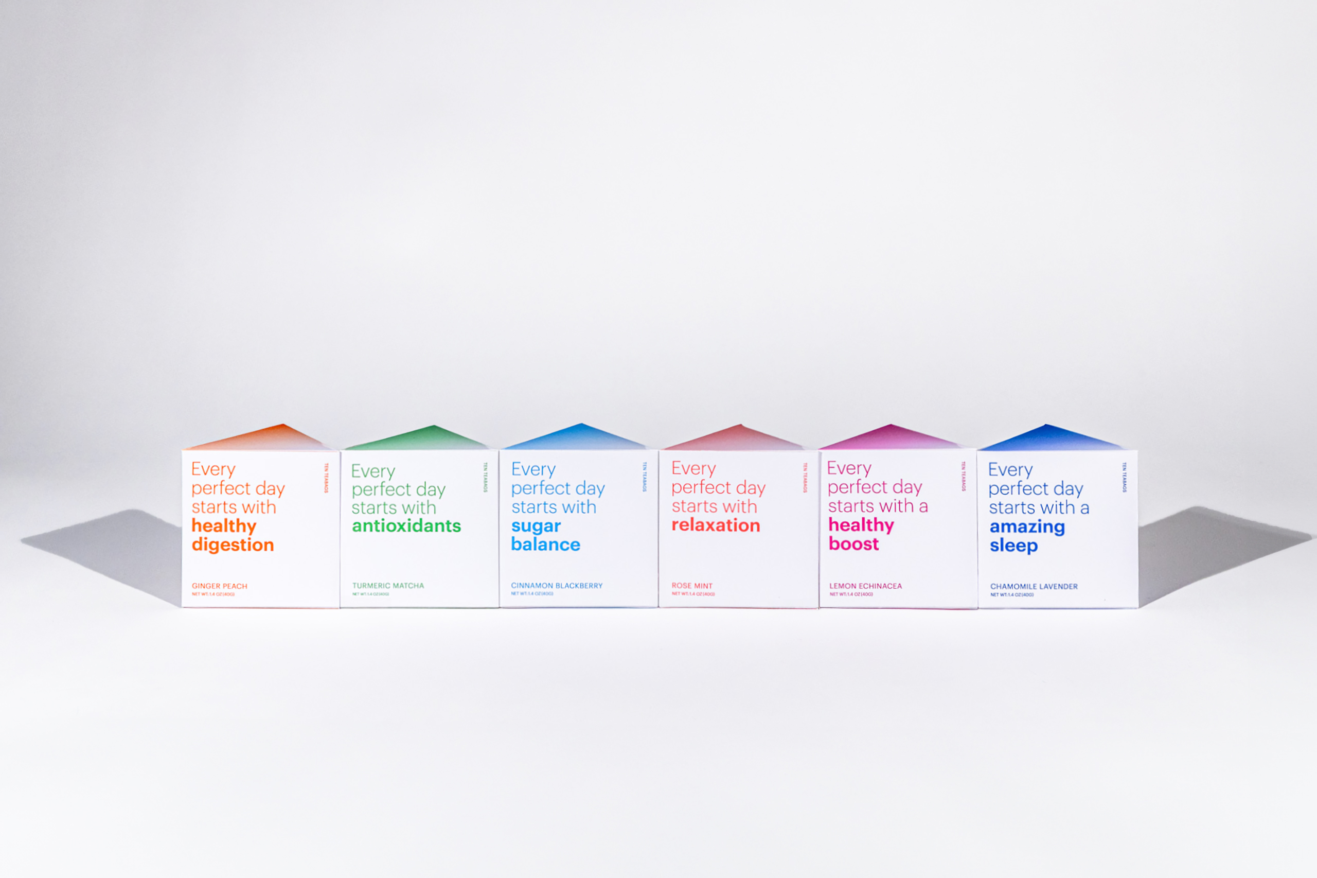
Redesign the Bigelow Tea Brand with a more contemporary look by reimaging for a range of flavors. This redesign eliminates traditional imagery, instead emphasizing bold typography and dynamic gradient color palettes to highlight and differentiate the functional benefits of each tea. The packaging features six triangular boxes, designed to interlock into a striking hexagonal form, reinforcing a sense of unity and versatility while enhancing shelf appeal.
